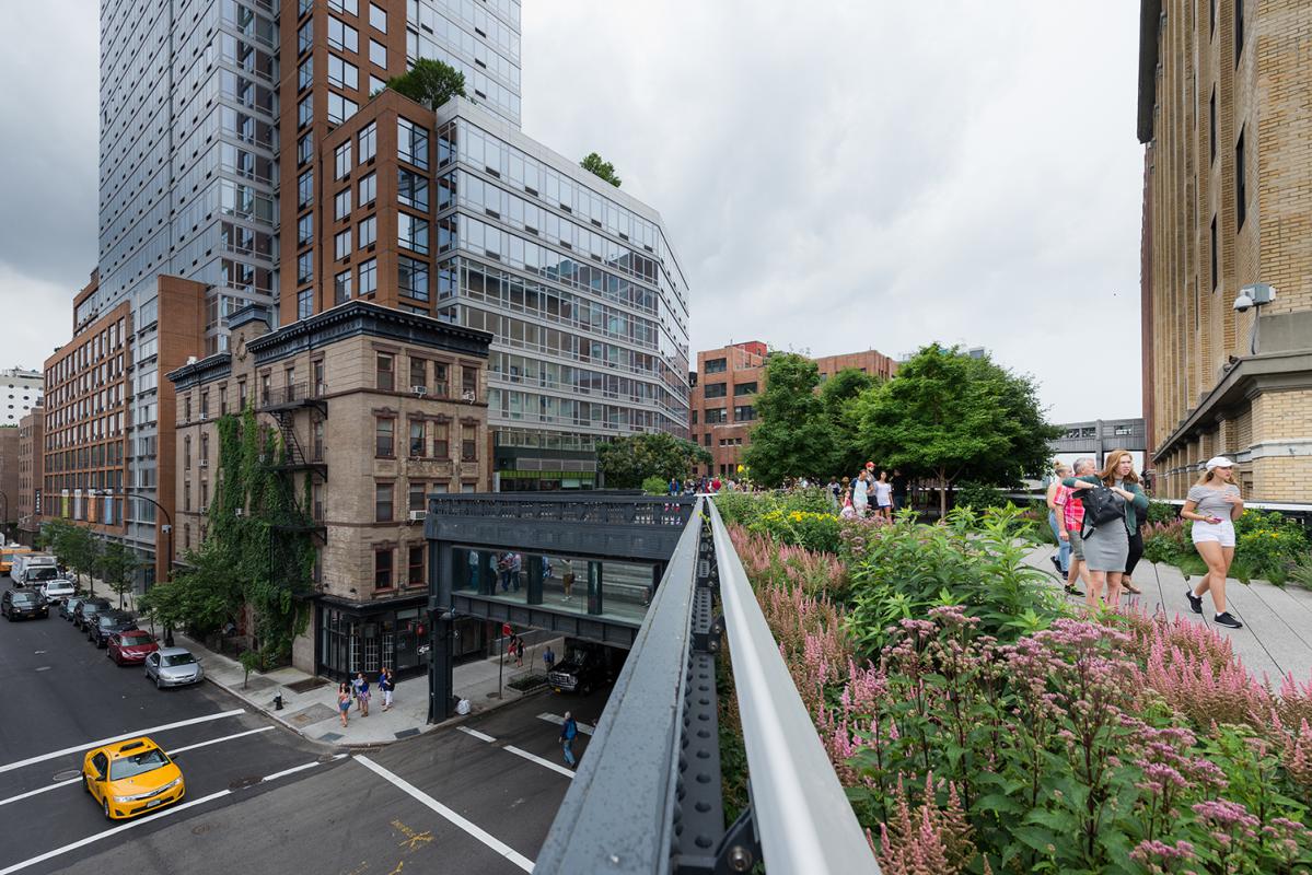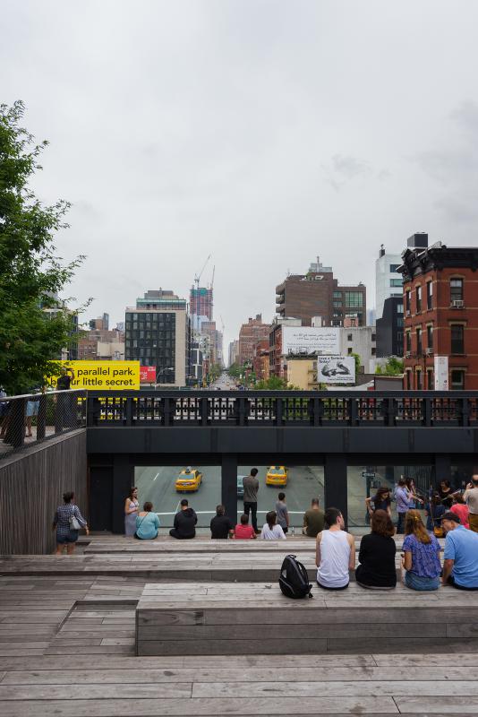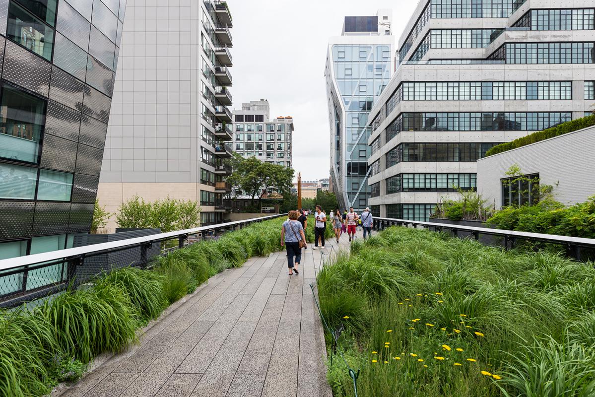
The High Line is one of the few projects in memory that has attracted almost universal praise. It's visionary, it's engaging, green, clean, and an increasingly rare piece of true new public infrastructure. Visiting New York a few weeks ago finally gave me the chance to see the High Line in person, and a chance to drill into what makes it work.
I'd had the pleasure of working with James Corner Field Operations—the landscape architects responsible for its design—a few years ago, at the time when wonder and interest in the High Line was at its peak. Everyone, it seemed, wanted to know how they could replicate its success. Lots of governments “wanted a High Line”—with good reason; billions of dollars sparked in symbiotic development, hundreds of millions generated in tax revenues. So commenced a global scramble to find every piece of forgotten infrastructure and revive it with a promenade and a sculpture garden. It still continues to this day—more about that later.
The success of the High Line has been attributed to many factors.
Robert Hammond, one of the founders of Friends of the High Line—the grassroots group responsible for saving and regenerating it—talks about the delight that New Yorkers had in discovering a rare piece of green wilderness on their doorstep.
While certainly true, it's obviously much more than this. For example, Riverside Park on the Upper West Side doesn't attract nearly the same attention or praise. And it doesn't explain the hordes of tourists that come to walk the High Line's length (and tourists certainly don't go to Riverside Park...).
Other people talk about the delight in seeing the city from a new vantage point—about 3 storeys above the street. And it is exciting to see the city in a new way. Views unfold giving a totally different understanding of familiar streets. Paris similarly redeveloped an old rail viaduct—the Promenade Plantée in 1994. While popular locally, it hasn't generated anything like the impact of the High Line.
So what is it about the High Line that works so well?
The contrasts in New York City make some of the successful elements of the High Line very apparent. The lack of quality from a pedestrian perspective in the general streetscapes is in stark contrast to the superb environment of the High Line.
 Four main points stand out to me. I'm not going to pretend that this is an exhaustive list, but there are clear fundamentals that can be applied in our cities here that would have meaningful impacts for many projects. My argument is that we don't need a High Line to solve every urban problem, but that we do need to be trying to understand why it is successful—and implementing those insights into our own urban projects right from the beginning.
1. Design Matters
This is the big one. And it's immediately obvious in contrast to the streets and incidental public spaces of much of New York.
When I say design here, I don't mean aesthetics. I mean thoughtful consideration of the environment we're creating. Photos I took from almost the same spot make this clear.
Where would you rather walk? There's no contest, really. The random accumulation of urban detritus—traffic signs, bins, pipes, and parking might have a charm, but it's obvious people prefer to walk the High Line.
2. Build a clear identity
When you compare the Promenade Plantée in Paris to the High Line, it's easy to see that the consistent design intention of the High Line creates a unique identity—a clearly memorable place. The Promenade Plantée is perfectly pleasant to wander through, but it lacks a real identity that distinguishes it much from any other park or garden in Paris.
Everything about the High Line has been considered—logo, branding, community engagement, the works. But the thing that creates the lasting memorable impression—even for people who have never been there—is the simple idea of it, which is represented perfectly by its design.
The design is incredibly effective—clearly one single thing from end to end. Clarity, legibility—a strong identity.
3. Variety is the best spice
The 2-km walk along the High Line is more than a simple promenade. Imagine you took the Sydney or Melbourne Domain, sliced it up, and put it back together in a line. That's the experience of the High Line. There is a whole variety of landscapes, art works, activities, and places to sit or linger. There are mini-amphitheatres, sun lounges, water and kids’ play areas, markets, changing views and vistas.
It sounds packed, intense. But it's all programmed out at an easy and deliberate pace, and feels like it evolves from one to the next rather than being all thrown together in a jumble. It's held together with the clarity of design noted in the above points.
This is a big contrast to the streets of most of New York (and most Australian cities too), where streets are mostly about vehicle movement, sometimes about bikes, and the pedestrian space is what’s left after you've added signage, bins, traffic lights, and some token trees.
Imagine the transformation if streets could be inhabited fully, without the commercial pressure of buying a coffee at a café that's taken another chunk out of the public domain with some wobbly chairs and tables. Streets could be real places to live in, rather than simply walkways from A to B.
Don't get me wrong—it would be a disaster if everything was turned into a perfectly manicured High Line-esque environment. Some of the magic of New York certainly stems from the grit of its streets. But I think we can have a bit of both, especially if you have to live in that place.
4. Design for experience
One of the things I like most about the High Line is that the design has never lost sight of its core purpose—it's a place for people. Lots of design looks like it's done for design's sake. It's as if as a profession we imagine that the only people using these creations will be other architects.
The High Lines feels unashamedly populist. It does this while still being contemporary, clever, and well designed. The ability to experience the existing structure and the surrounding city have been taken at every opportunity. Sunny spots are taken for benches or seating. Walkways rise up through the growing tree canopy, and there's even a children's playground amongst the exposed girders of the existing structure.
As well as the range of experience, it's also free from the authoritarian instructions and programming of our streets. Walk; don't walk. No loitering. No parking. No standing. No right turn. Don't stop. Don't look. No fun allowed.
The only instruction on the High Line is more a plea aimed at overly enthusiastic photographers: "Please keep off the plants." The rest of it invites—rather than instructs - use. It makes for an easy and enjoyable 2-km walk, rather than the physical and psychological battle to cross the city on the street.

In summary (and a challenge)
Australian cities are going through an incredible urban revolution. Most of this is forced by the hand of population growth, but there is an intense desire of younger generations to live in the city—in highly urbanised areas. The question of what is the right density, and the right amenity, is an ongoing one that doesn't feel adequately answered yet.
Last year, I went to the briefing session for Urban Growth's Central to Everleigh project. It's a mammoth piece of urban strategy that can change the entire dynamic of Sydney's core. Troy Daly from Urban Growth talked passionately about the opportunities but also speculated that “maybe it needed a High Line to tie it altogether.”
I'm sure he didn't literally mean another High Line, but it's had me thinking ever since then—why couldn't it just be a street? What if all the effort, vision, and hard-arsed persuasion that went into the creation of the High Line could be applied to some great streets in Sydney. Or even just a great street. Why is it so easy to imagine a high line, but retreat from an intention about our streets being great places for people?
There a plenty of excellent urbanists in Australia, and many of them have been saying similar things for long time. But it's easy to get locked into a preconception of what a street is. At the mention of a “street” most designers start sketching out a section—3 meters for people, 3 meters for parking, 3 meters for a traffic lane... You can see how it goes wrong.
Taking lessons from the success of the High Line, we should embark on a complete re-think of what we mean by “street.” Let's imagine the places that we love to visit and then make our streets the places we love to live in.
Design High Lines and High Streets, not High Lines and low-lifes. ![]()

